Forget the Tape Measure: Why Your Fireplace Needs a Focal Point
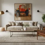
We have all walked into a room where something felt just a little bit “off.” You look at the fireplace, and the wall above it looks like a missed opportunity—the art is too small, too high, or just plain lonely. It is not that you have bad taste; it is that the fireplace is a demanding architectural beast. If you do not give it a partner that matches its scale, the whole room feels out of balance.
The trick is not to be a mathematician; it is to understand how the eye travels across a wall. When you walk into a room, you want your gaze to land on the fireplace and then move smoothly to the art, not jump around trying to figure out why the piece feels like it is floating away.
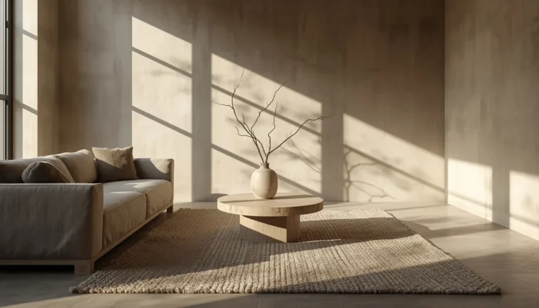
Think of your mantel as a stage. If you put a tiny, solo performer on a massive stage, they get lost. If you crowd the stage, it becomes a mess. You want that perfect moment where the art fills the space just enough to make the room feel settled, cozy, and intentional. When you hit that sweet spot, you stop seeing “a painting on a wall” and start seeing a room that finally feels finished.
The Art of Visual Harmony: Getting the Scale Right
Instead of obsessing over exact centimeters, think about the “visual footprint.” A fireplace is a heavy, grounded element. The art above it needs enough physical presence to hold its own against that weight.
If you are working with a standard 60-inch mantel, you are not just looking for a frame; you are looking for a statement. A piece that spans roughly 40 to 45 inches is going to be your best friend. It is wide enough to respect the scale of the fireplace, but it leaves just enough breathing room on the sides so the wall does not look like it is being suffocated.
Think of negative space not as ’empty’ wall, but as an active framing device. In a smaller living room, maintaining at least 10% of the wall width as negative space on both sides of your art tricks the brain into perceiving the wall as wider than it is. For more specific advice on how to optimize these tight quarters, see our small living room layout guide to ensure your furniture placement supports your decor. If you hang art that stretches from edge to edge, you effectively ‘cap’ the room’s height and width, making the space feel enclosed. By leaving this margin, you allow the wall color to bleed into the composition, creating an illusion of depth that makes the hearth area feel like an extension of the room rather than a wall-mounted add-on.
Why “Floating” Art Ruins the Vibe
We have all seen homes where art hovers like a satellite, creating a visual disconnect. Your fireplace is the hearth—the center of the home—and your art is the soul; they must be physically linked. When you keep your arrangement in that 60% to 75% width range, you create a cohesive visual block. This balance is further governed by the ‘Rule of Thirds’: the fireplace anchors the bottom third, while your art should dominate the top two-thirds. Filling this space with a cluttered gallery wall eliminates the negative space the eye needs to breathe, often making the room feel top-heavy.
Whether you are choosing one massive, dramatic canvas or a curated collection of family photos, the logic remains the same: treat the whole arrangement as one solid unit. If that unit feels too skimpy, add another frame. If it feels like it is bumping into the edges of the mantel, pull back. You are looking for that moment when the wall suddenly feels “full” in the right way.
When arranging these collections, avoid the ‘uniform-gap’ trap—where every frame is separated by the exact same distance. Professional designers use a ‘tapered density’ framework: place your heaviest, largest pieces at the center of the mantel and allow smaller items to drift slightly further apart toward the outer edges. This mimics the stability of a pyramid. If you use rigid, identical spacing, the eye struggles to find a natural focal point, which creates subconscious visual tension instead of the intended sense of order.
There is one critical situation where you should ignore the 75% rule: When your fireplace wall is a high-contrast focal feature—such as floor-to-ceiling stone, dark shiplap, or vibrant tile. In these cases, a 75% wide piece can actually ‘fight’ the texture of the fireplace. Instead, opt for a smaller, vertical piece that covers only 40% to 50% of the mantel width. This creates a minimalist ‘window’ effect that allows the fireplace’s own architectural texture to remain the star of the show. If your fireplace is simple (neutral paint or standard brick), the 75% rule is your best friend; if your fireplace is a statement on its own, use your art as a quiet accent.
Choosing Your Medium: Canvas, Print, and Metal
Materials matter more than you think. The space above a fireplace is a unique micro-climate; it gets warm, it might see a bit of soot, and it is usually the brightest spot in the room.
- Canvas: This is the workhorse of mantel decor. It is lightweight, does not suffer from glare, and brings a soft, organic texture that pairs beautifully with stone or brick.
- Framed Prints: If you go with photography or detailed prints, make sure you use non-glare glass. In rooms with high natural light, standard glazing can reflect 10% to 15% of incoming light, effectively obscuring the image. Museum-grade, anti-reflective glass reduces this to less than 1%, ensuring the art remains visible even when the sun is at its brightest. Because of the way light hits a mantel, standard glass can turn your art into a giant, distracting mirror.
- Metal Art: If your style is industrial or modern, metal pieces are fantastic. Just watch out for windows across from the fireplace, as the reflection can be harsh during the afternoon.
- Lighting: If your fireplace has integrated spotlights or wall-washers, avoid high-gloss surfaces. The concentrated light creates a “hot spot” reflection that masks the image from your seating area. Always opt for matte-finish canvases or prints; the matte surface diffuses concentrated light beams, effectively absorbing the glare and keeping the art visible from every angle in the room.
The key takeaway here is durability. Avoid anything that feels fragile or heat-sensitive. A thick, oil-painted canvas can stand up to the heat of a fireplace for years without warping, whereas a cheap paper print might start to ripple after a single winter season. Beyond the visual appeal, heat damage is a reality for mantel art. Before hanging, perform a ‘hand test’ during your next fire. If the area above your mantel feels warm to the touch, your art is at risk. For high-heat environments, wood-backed frames are prone to warping; canvas or metal are the only materials that remain stable under consistent thermal fluctuations.
Before you commit to a medium, weigh the trade-offs. Canvas is your low-risk choice—it handles humidity and heat shifts with minimal expansion. Framed prints offer a higher-end look but carry the risk of ‘glass-fogging’ in humid climates or glare in high-light rooms. Metal art is the high-reward, high-maintenance option; it is practically indestructible, but it will reflect your room’s artificial lighting directly into your eyes if the angle is even slightly off. If your fireplace is in a high-traffic or high-humidity area, prioritize stability (canvas) over aesthetic trend (metal)
However, also consider ‘Chromatic Weight’ alongside physical width. High-contrast art—such as black-and-white photography or deeply saturated oil paintings—exerts more visual pressure than soft, neutral palettes. If you are using a high-contrast piece, you can safely scale back to 60% of the mantel width without it looking ‘lonely,’ as its color intensity provides the anchor that physical size would otherwise provide. Conversely, if your art is low-contrast or monochromatic, aim for the higher end of the 75% range to ensure it does not vanish against the wall color.
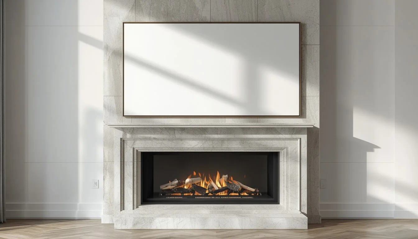
The Secret to a Perfect Hang: The 5-to-8 Inch Rule
I see more art ruined by height than by anything else. If you hang your art too high, you create a “dead zone” between the mantel and the bottom of the frame. It looks awkward and leaves the mantel looking naked.
Your goal is the 5-to-8 inch gap. This is the sweet spot. It provides enough space so you can still put a few decorative items—like a small candle or a vase—on the mantel without them overlapping the art, but it is close enough that the art and the mantel feel like they are part of the same display. There is a mathematical tension between the mantel’s shelf depth and the frame’s weight. A heavy, deep-profile frame has ‘visual mass’ that pulls the eye downward. If you have a deep mantel, your art’s visual mass is already competing with the shelf’s protrusion. In these cases, you should lean toward the 8-inch end of the gap range. Conversely, if your mantel is a thin, architectural ledge, the lack of shelf-weight allows you to hang the art closer to the 5-inch mark. Balancing the physical projection of the mantel against the visual weight of the frame is the difference between a display that looks ‘pushed’ off the wall and one that feels anchored. While standard wall art is typically hung at 57 inches from the floor to the center, mantel art is the notable exception to this rule. Because the mantel serves as a visual base, you must prioritize the distance between the shelf and the frame over the standard eye-level measurement.
- Step One: Find the center of your mantel.
- Step Two: Measure 6 inches up from the shelf. That is your baseline.
- Step Three: Use a level. I cannot emphasize this enough—do not trust your eyes. Floors and mantels are rarely perfectly level, but your art must be.
- Step Four: Check the clearance. If you have a fireplace that throws off a lot of heat, try to keep the bottom of your art at least 10 inches away from the firebox opening itself.
When locating your center point, account for the ‘Visual Axis’—the invisible vertical line that connects the center of your firebox, the mantel, and the ceiling. If your firebox is slightly off-center, a common occurrence in older homes, do not center your art on the mantel shelf itself. Instead, center your art on the firebox opening. This aligns the art with the ‘hearth of the heat,’ creating a harmonious vertical flow even when the fireplace masonry is asymmetrical.
Instead, use a French cleat. For heavy pieces, skip the wire, which stretches over time and causes tilting. Instead, use a French cleat. Because drywall is merely a finishing layer, you must transition the ‘Live Load’ (the frame’s weight) to the home’s structural studs. By spreading the frame’s weight across 16 inches of wall studding using a cleat, you eliminate the ‘creep’ effect where a single nail slowly enlarges the drywall hole, preventing the art from pulling away from the wall over time.
Solving the “Ugh” Moments: Common Mantel Friction Points
“My fireplace is off-center.”
Do not try to force symmetry. If the fireplace is pushed to one side of the wall, treat the entire wall as your canvas. Use a larger, more dominant piece of art that pulls the eye away from the off-center fireplace, or create an asymmetrical gallery that flows toward the wider side of the wall.
“Can I lean my art instead of hanging it?”
Leaning is a great way to get a relaxed, “undone” look. But, it only works if the art is substantial. If you lean a tiny 8×10 frame, it looks like you just forgot to hang it. If you lean a large, oversized canvas, it looks like a high-end design choice.
Deciding to lean instead of hang is a trade-off between style and safety. Leaning provides a relaxed look and zero wall damage, but it is fundamentally unstable. If you have children, pets, or an area with frequent floor vibrations, the risk of a heavy frame slipping or falling far outweighs the aesthetic benefit. As a rule: if the frame is wider than 24 inches or heavier than 10 pounds, always use a safety-cleat or wall-mount, even if you are aiming for a ‘leaned’ appearance. You can achieve the same aesthetic by hanging the art flush to the wall but selecting a frame with a wider, chunkier profile that mimics the depth of a leaning piece.
“How does my mantel depth change how I hang my art?“
If you have a deep, substantial mantel shelf, you have more freedom to layer. You can place taller vases or decor items on the shelf itself, even slightly overlapping the lower edge of the art. This creates a beautiful, collected look. If your mantel is shallow, keep the art higher within that 5-to-8-inch range to prevent your decor from feeling cramped.
“What if I have a TV up there?”
If you have a TV mounted above the fireplace, my advice is simple: stop. Don’t add art. You already have a large, dark rectangle taking up all the visual weight. Adding art around a TV creates a cluttered, busy wall that never feels quite right. If you have to have the TV there, embrace the minimalism and leave the wall empty, or use a “frame TV” that mimics art when it is turned off.
If a TV is your only option, acknowledge the trade-off: you are prioritizing utility over aesthetics. If you choose this path, the biggest mistake is adding surrounding decor; it turns a ‘functional necessity’ into a ‘design disaster.’ The decision here is binary: either treat the TV as a neutral black box by leaving the wall completely bare, or invest in a ‘frame TV’ to bridge the gap. Any other attempt to decorate around a standard TV will only highlight the lack of proportion.
ANALYSIS & MARKET IMPACT
The trend in 2026 leans heavily toward oversized, single-panel canvas art. Homeowners are moving away from intricate, multi-piece gallery walls in favor of clean, large-scale statements that reduce visual clutter. This shift reflects a broader market movement toward quiet luxury in residential design. This approach is a cornerstone of cozy minimalist living room ideas, where clean lines and intentional art choices create a sophisticated, restful environment. By using one dominant piece, you simplify your styling requirements and create a more professional, curated atmosphere. The demand for oversized canvas has surged as people seek to maximize their living room’s perceived volume without sacrificing the warmth provided by traditional landscape motifs.
THE ANSWER CAPSULE
To achieve visual equilibrium over a standard 60-inch mantel, select canvas or framed art spanning 45 to 50 inches in width. This follows the 75% rule, which maintains scale without overwhelming the architectural focal point. Using pieces smaller than 40 inches creates a “floating” effect, while exceeding 55 inches creates visual clutter that competes with the fireplace. For optimal balance, the bottom edge of your art should sit 5 to 8 inches above the mantel shelf.
STRUCTURAL DATA MATRIX
| Mantel Width | Ideal Art Width (75% Rule) | Recommended Orientation |
| 60 inches | 45 inches | Horizontal Landscape |
| 72 inches | 54 inches | Horizontal Landscape |
| 48 inches | 36 inches | Portrait / Square Set |
The Intentional Home: Why Scale and Balance Matter Above Your Hearth
At the end of the day, the goal of styling your mantel is not to perfectly replicate a math equation, but to create a focal point that makes your home feel like yours. Whether you choose a massive, oversized canvas that anchors the room with quiet luxury or a carefully curated set of frames that tells a story, the secret is intentionality. For a holistic approach to your entire home, our living room decorating guide provides the structural rules needed to align your art, rugs, and seating into one cohesive design.
We are seeing a major shift in 2026 toward simplicity. Homeowners are stepping away from the “clutter” of complex gallery walls and moving toward cleaner, larger-scale statements. This trend is about more than just aesthetics; it is about maximizing the visual volume of your living room and creating a space that feels calm and curated rather than busy.
No matter the shape of your fireplace, keeping that 75% width ratio in mind will always give you a solid starting point.
Ultimately, your fireplace is the heart of your home. Give it the partner it deserves, follow the scale that respects its architecture, and you will find that the space above it becomes the most professional, inviting part of your entire living room.
Frequently Asked Questions
The best wall art size is one that measures 60% to 75% of your mantel’s width. For a standard 60-inch mantel, this equates to a piece spanning 36 to 45 inches. This ratio ensures the art acts as a substantial focal point without overwhelming the fireplace architecture.
Yes. If your fireplace features high-contrast textures like floor-to-ceiling stone or dark shiplap, you should ignore the 75% rule. In these cases, a smaller piece—covering only 40% to 50% of the mantel width—is “best” to allow the fireplace’s architectural texture to remain the star.
The “best” hang requires more than just size; it requires structural integrity. Always center your art on the firebox opening (the “hearth of the heat”), maintain a 5-to-8-inch gap from the shelf, and use a French cleat for any art over 15 pounds to prevent drywall damage.
Aim for a gap of 5 to 8 inches between the mantel shelf and the bottom of the frame. This “sweet spot” links the art to the fireplace, preventing the “dead zone” of empty wall space that often makes rooms feel unfinished or poorly scaled.
Do not force symmetry by centering art on the mantel shelf. Instead, center your art on the firebox opening (the “hearth of the heat”). This aligns the art with the room’s functional focal point, creating visual harmony even when the surrounding masonry is asymmetrical.
For art over 15 pounds, skip standard wires, which stretch and tilt. Use a French cleat mounted into the structural wall studs. This distributes the “Live Load” (the frame’s weight) across 16+ inches of wall, preventing the “creep” effect where nails slowly enlarge holes and pull away from the wall.
Canvas and metal are the most stable materials for high-heat micro-climates. Avoid paper prints or wood-backed frames, which are prone to rippling, warping, and “glass-fogging” due to consistent thermal fluctuations. If you must use a print, ensure it is behind museum-grade, anti-reflective glass.
It is generally advised to avoid this. A TV is a large, dark visual weight; adding art around it often results in a cluttered “design disaster.” The best approach is a binary choice: leave the wall bare for a minimalist look, or invest in a “frame TV” that mimics art when powered off.